product content designer ⭐ ux writer extraordinaire ⭐ experience & solutions architect
sabrina k. chun
What makes a great onboarding experience? We included the basics:
a friendly welcome message
a product tour guide to take the user and explain each product’s feature
progress bars to show the length of the onboarding experience
checklists for to-do tasks
hotspots to direct attention to certain features without interruption
action-driven tooltips to give advice when a specific action is performed
personalization to tailor the product experience based on the user’s responses to a short survey
onboarding made seamless through a personalized tailor-made journey

How to design a truly great onboarding experience for a complex management platform? Our North Star question when revamping the entire Control Hub onboarding experience. Previously, onboarding consisted of two parts: 1) the Setup Guide (formerly known as the Getting Started Guide) for a checklist of setup tasks, then after completing half of the mandatory tasks, 2) Webex Experience (formerly known as Org Health) to provide insights and more tasks for new configurations, service adoption progress, and any performance bottlenecks. Admins new to Cisco often find the vastness of Control Hub confusing and new admins can find first-time device and service configuration intimidating.

To level up the current experience to a persona-based one, we introduced Control Hub as a Coach—not just a navigator of the ship, but a seasoned tour guide after landing the boat in the harbor. Beyond the standard mandatory configuration tasks, we’ll add a questionnaire. This is now a premium tailored journey, custom-fit for each unique customer based on their lifecycle, organization sizes, and admin roles.
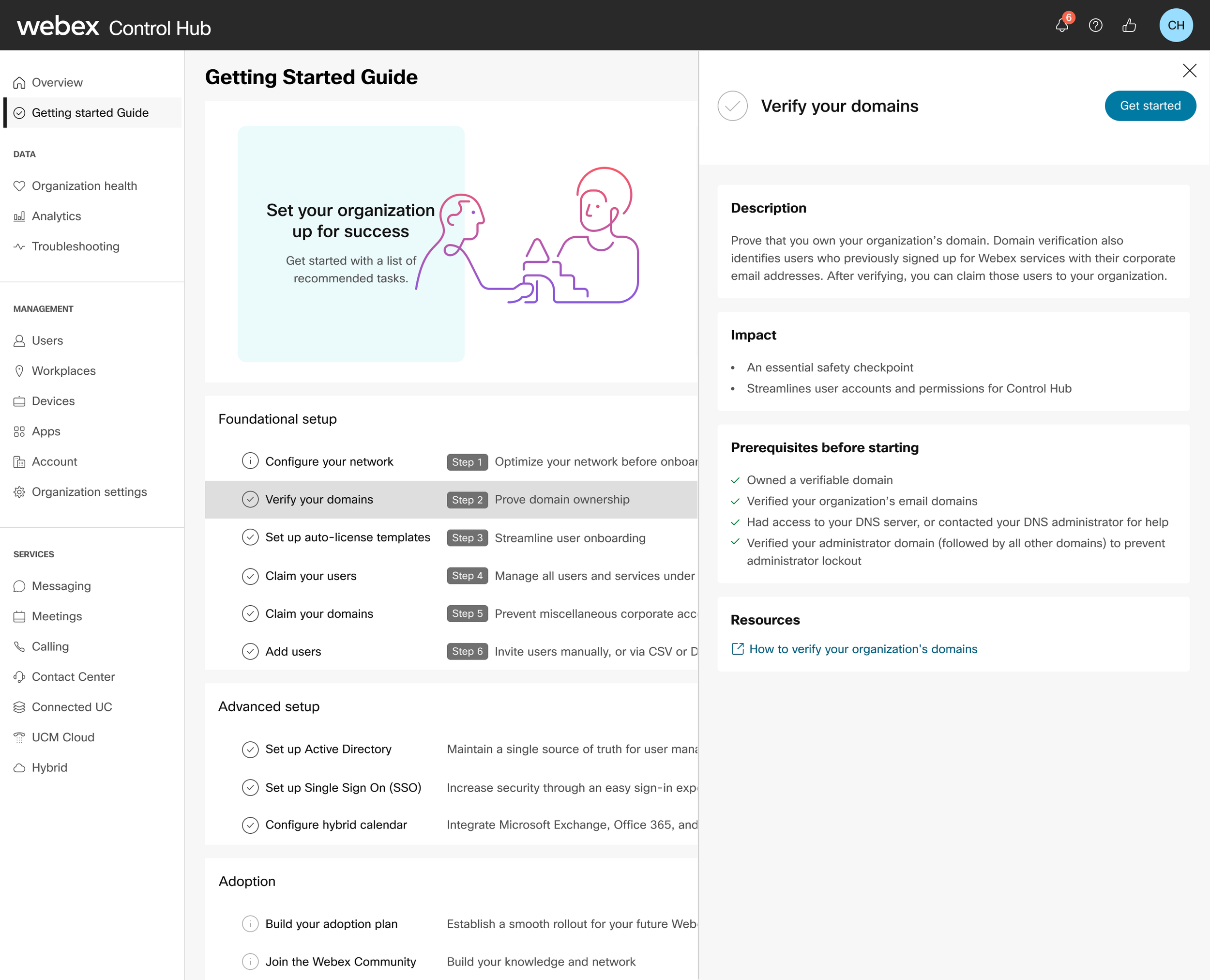
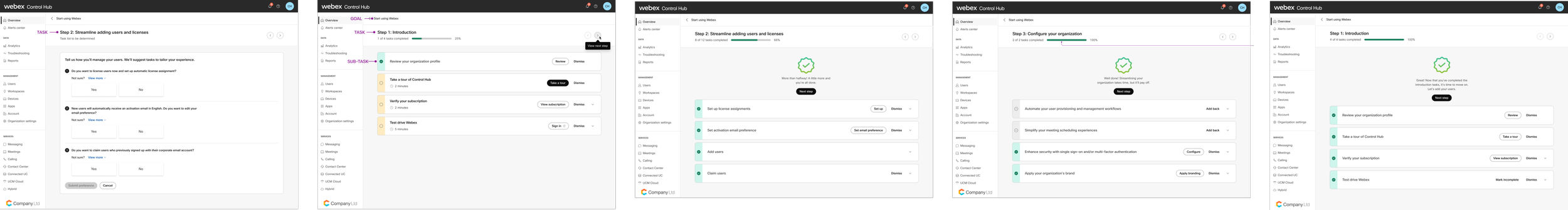
I started by paring down and whittling the pre-existing tasks provided by the product owners. This would prove to be a recurring theme throughout my time at Cisco—simplifying text for maximum scannability.

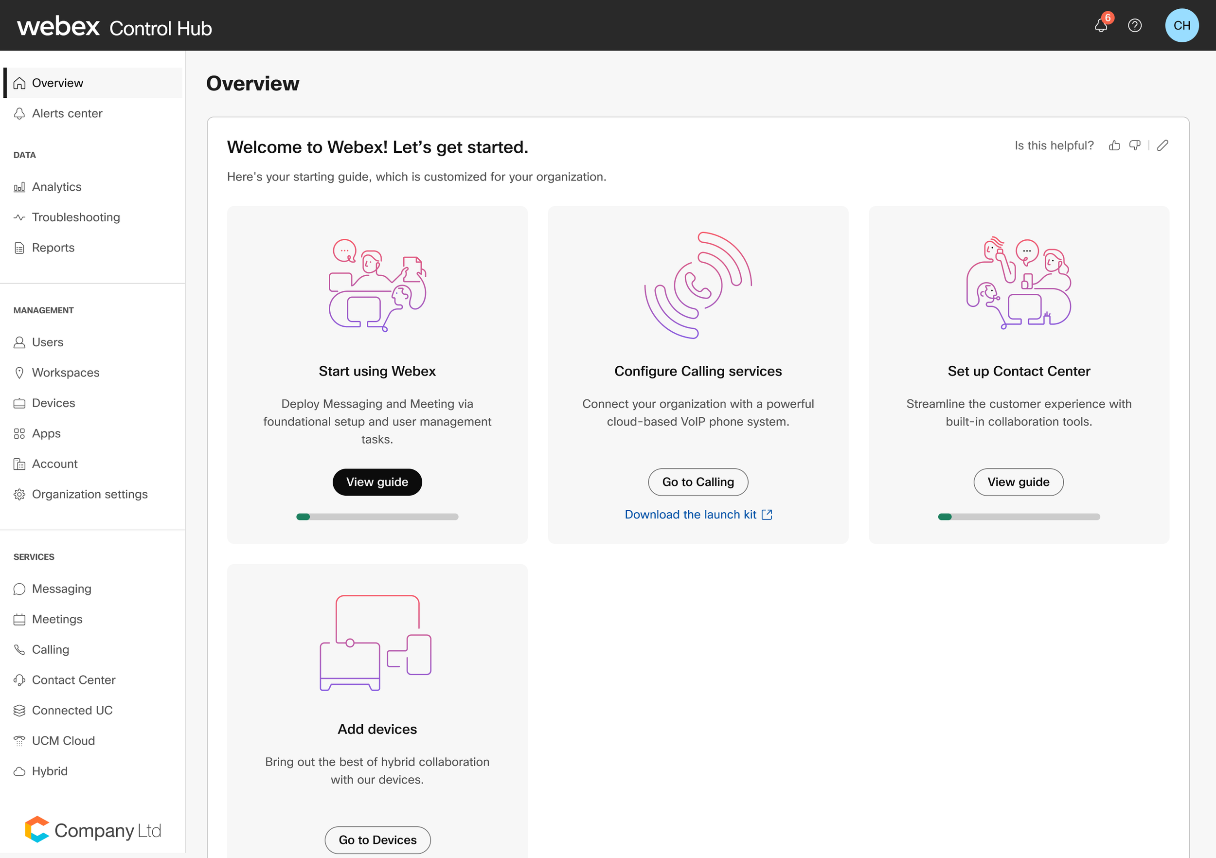
The main outcome for admins is to get started in Webex via the Overview page, and the first goal is the Setup guide. Setting up and configuring subscriptions to other products, like Webex Calling or Contact Center, are more goals. Within each goal are tasks and then sub-tasks.
Although the existing onboarding experience for both the Getting Started Guide and Webex Experience featured light gamification through task progression and completion, creating personalized journeys required a more expansive and outcomes-based framework.
We also wanted to level up the gamification features, to make it as attention-catching while efficient. From our enterprise competitors, we drew inspiration from Microsoft Azure Advisor, Microsoft 365 Admin, Zoom, Google Admin, and from others, Zero (a fasting app), Apple Health, Xfinity, and TurboTax.
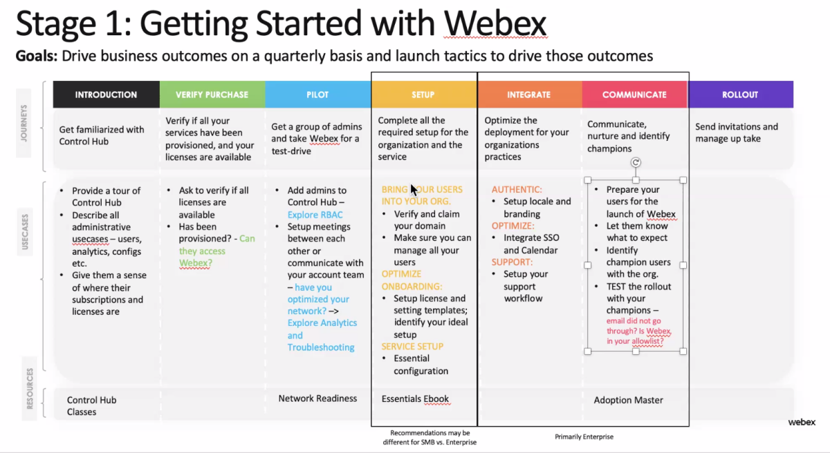
We revisited the journey map and an updated list of tasks to reorganize them within the three phases of our new outcome framework:
Plan (Getting Started with the mandatory setup tasks) — create a warm, welcoming experience, create a clear path forward, minimize deployment time,
Launch (tailored goals and adoption setup with Webex Experience) — leverage usage data to drive outcomes and focus on goals
Grow — any lingering setup tasks or goals as informed by usage
I drafted the anatomy of each piece of content:
Goal via an illustrated card
title, description, a single action button, and link
located on the Overview page as level 1
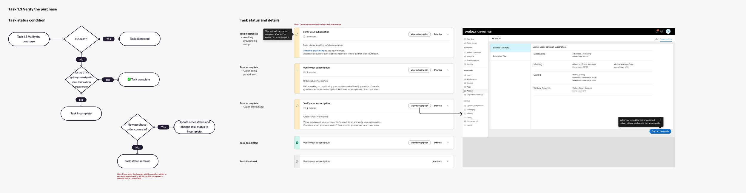
Task and sub-task
title, time estimate, action buttons, description, steps, selectable cards, status, links
located on the next page, Start using Webex, as level 2
also located on its own task page as level 3 and as a suggested task list after answering each question
Questionnaire
question, description with progressive disclosure to view more, selectable cards
Tips and resources via cards
title, description, link
Coach mark
title, description, action buttons
from start to finish with each task, especially the product tour
Toast message
title, description
Progress badge
description, button
Main action buttons
buttons to go back or forward to the next task or to the guide
The new content—such as the questionnaire, gamification pieces, coach marks, and additional goals and tasks—required the same helpful, encouraging, and cheerful tones (Spirited and Diligent) I had already established when I had rewritten the fka Getting Started Guide tasks.
Updates to the content and design (see and compare the previous version):
And the refreshed Setup Guide, with Control Hub as a Coach.
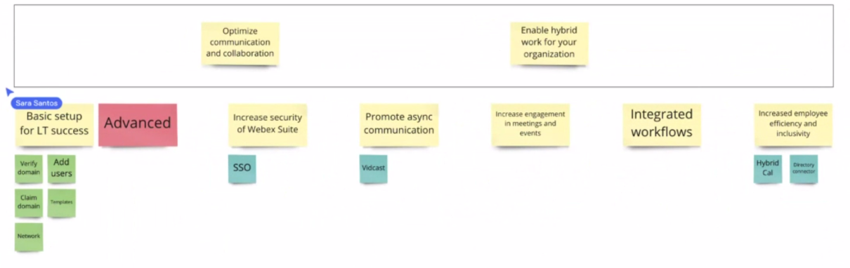
Then mapping out each potential task path—completed, dismissed, or incomplete. And of course, each of the questionnaire answers and the suggested task lists.
Summer 2022
• Method: Concept validation sessions
• Participants: 1x customers and 2x partners
• Goal: Uncover comprehension, value perception
Fall 2022
• Method: Unmoderated usability test on UT.com
• Participants: 7x IT admins
• Goal: Assess learnability, efficiency, memorability, errors, and satisfaction
Our research results, after running usability tests:
Participants found the product tour easy to follow and helpful, especially for learning beyond baseline usage. Medium-severity issues included trouble locating the tour because they expected it to start automatically, and confusion at its abrupt ending.
Recommendations: a clear completion step and guidance on where to find future help
However, the screen title for the adding user questions caused high-severity confusion. They thought that they were immediately adding users instead of setting their preferences. They also experienced medium-severity confusion because they expected immediate feedback and seeing their choices reflected sooner.
Recommendations: clarify that users are choosing preferences as a task, and consider showing questions with answers on the same screen for continuity
More high-severity confusion occurred when participants struggled to find the CSV upload screen, with 4 of 7 failing the task and others needing multiple tries. They reported that the Manage users button had low visibility. Misleading titles came up again, because it implied that they’d upload users immediately instead of being shown where and how to do it in Control Hub.
"This option was not clear. I would've expected a CSV option to appear itself."
"I was expecting a page where I would upload the file. What I'm seeing is the users that has been added before."
Recommendations: make the Manage users button more visible and adjust the page title to clarify it’s instructional, not the actual upload step.
Not only is this a gamified guide, but an efficient task-solver. Leveling up gamification provides an more engaging experience and to incentivize users to achieve their unique, custom goals.
See the old Getting Started Guide here.