building a new one stop shop

an efficient experience for businesses to function without friction
The designer and UX writer booked a coveted 11 AM slot in a huddle room with a researcher, two developers, and two product owners. The designer and writer conducted standard UX iteration exercises for this project kick-off, from post-it card sorting to drafting a mission statement on the white board.
The mission statement I wrote on August 7, 2019 became our north star for the months ahead: “The Chase Business payments ecosystem creates efficient experiences for our customers and their customers alike. We make moving money easier so businesses can function without friction.”


Partners
Product (the main Payment Center owner, along with the respective Wires, Bill Pay, QuickPay with Zelle®, and ACH owners)
Design
Research
Tech
BSA + scrum team
Legal
Challenges
Aside from fees, customers don’t care how they’re paying but are instead more concerned with who they’re paying and when the payments will reach the payee. By creating a cohesive payments experience across Bill Pay, QuickPay, ACH, and domestic wires, customers can choose their preferred payment types. It’s inherently task-intensive to send and track secure payments. We had to combine four existing payment systems (technically five, because we offer two different ACH types) into one new platform. Additionally, some of the features, like real time payments and a payment tracker, were also brand new to Chase.
As a writer, I was initially wary of information overload, but an exceptionally text-heavy page was necessary. I also had to find common ground with product owners that wanted specific tile content and placement. For example, the Bill Pay product owner wanted to remind users that they can remove the hassle of checks through an additional right rail tile.
Additionally, we had to use “ACH Payments, Bill pay, QuickPay with Zelle® & Wires” as our working title. Our products are traditionally listed as single entities under the “Pay and transfer” tab label, so users first had to become socialized to “Payment Center” as a name.


Research (August 15-16 2019)
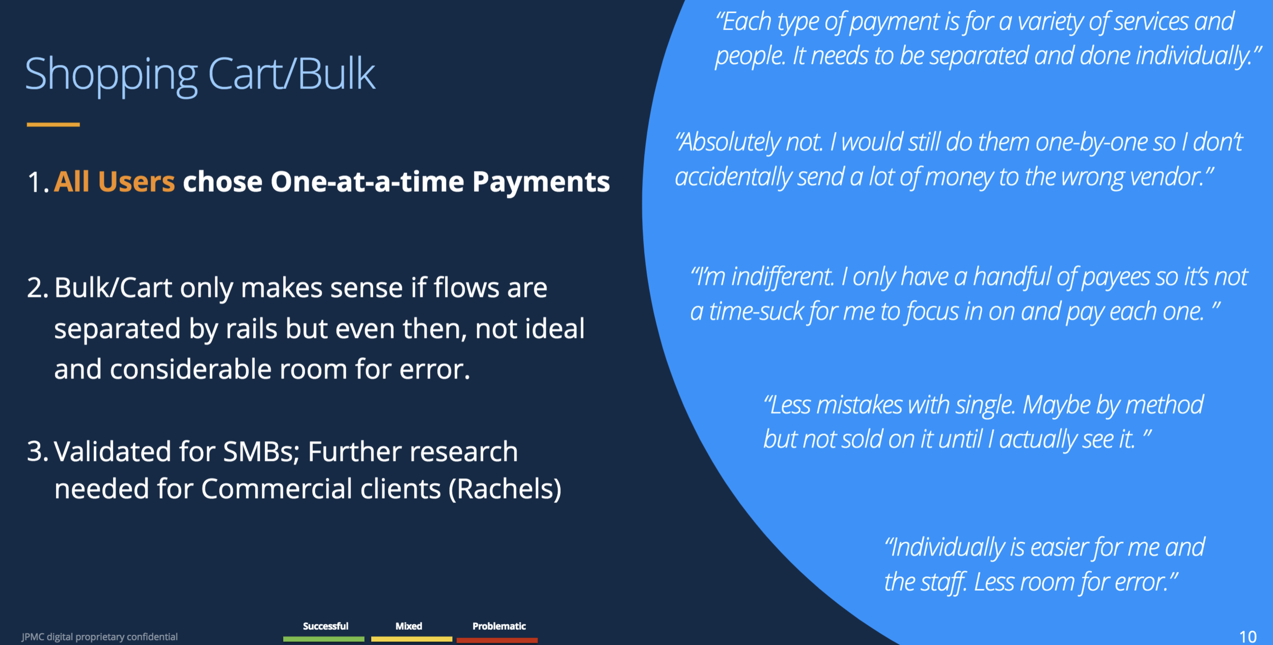
Most of our participants, small business owners, already banked with Chase Business. We tested usability through three prototypes, walked them through payment tasks, and asked them to detail their payments processes. These business owners are already experts with their accounting, often using tools like QuickBooks, and all preferred using computers than phones to minimize potential mistakes. The main product owner envisioned a shopping cart experience for users, but our participants emphatically told us that they always make payments one at a time because bulk payments leave room for error.
We discovered that the recipient list, as organized by payment method, is the ideal treatment. More than a few suggested to toggle between frequent and recent recipients. I noted that people chose “frequent recipients” over “top.” Information overload wasn’t an issue, but they did tell us which content pieces they thought were unnecessary. I also crowdsourced variations of payment taglines.
Before and after
Product tile taglines, recipient list, segment lists, and the whole page, respectively, from August 2019 to February 2020.


Results
We breathed life into the impossible: we made the Chase Payment Center. Despite uncertainty at delivering a functioning payment tracker, our developers triumphantly pulled through. More features are slowly being rolled out; for example, there are now have credit card payments.
The screenshots and flow are from February 2020, when I officially left this project. As this was well-received to Chase for Business customers in December, I’m hoping that the “ACH Payments, Bill pay, QuickPay with Zelle® & Wires” title can finally change to “Payment Center.”

content design
-
Webex’s Content Design team
introducing Webex’s voice and tone
updating Webex’s voice and tone
Momentum Design System
creating a content design system
implementing a content-ready checklist for designers
Write Like Webex
supporting and rolling out Webex’s gen AI writing tool
ux writing
-
Control Hub
⭐ revamping and restructuring organization settings
⭐ creating a Getting Started guide
⭐ crafting a gamified security coach
Partner Hub
⭐ revamping and restructuring organization settings
⭐ creating a Getting Started guide
⭐ crafting a gamified security coach
Contact Center for admins
⭐ revamping and restructuring organization settings
⭐ creating a Getting Started guide
⭐ crafting a gamified security coach
Cisco Unified Identity
⭐ revamping and restructuring organization settings
⭐ creating a Getting Started guide
⭐ crafting a gamified security coach
-
conversational
design
-
Cisco AI Assistant for Control Hub
⭐ crafting AI Assistant messages for our admin audience
-
Chase Digital Assistant
content strategy
-
Digital Wealth Management
⭐ improving visual data for landing pages
⭐ optimizing double entry points for the most direct user journey
-
Digital Wealth Management
⭐ improving visual data for landing pages
⭐ optimizing double entry points for the most direct user journey
product copywriting
-
Chase Bank: Inclusive Design Guild
⭐ Anti-racism open letter (October 2020)
Potli
⭐ Potli's Guide to Your Star Sauce (January 25, 2022)
NYC Democratic Socialists of America
⭐ The NYC Thorn, No. 43: Council Speaker Candidates Court Joe Crowley’s Support (December 11, 2017)
Pandia Health
⭐ Graham-Cassidy Repeal: We’ve Dodged Another Bullet. For Now. (September 26, 2017)
-
Blackprints
⭐ Blackprints kickstarter + blog updates (April 2013)
Halo Belt
⭐ HALO Belt 2.0 kickstarter campaign + blog updates (February 2014)
⭐ HALO Mini kickstarter campaign + blog updates (May 2013)
⭐ HALO Zero Bag kickstarter + blog updates (January 2013)
⭐ HALO Belt kickstarter campaign + blog updates (June 2012)
Note: I’d change the tracker tile to delete the “Stay up to date on where your money is” is not only a terrible sentence, but it’s also redundant. I’d also change the next line to “On the way” and remove the right rail Bill Pay nudge, as users would already enroll if they wished.


