data visualization for landing pages
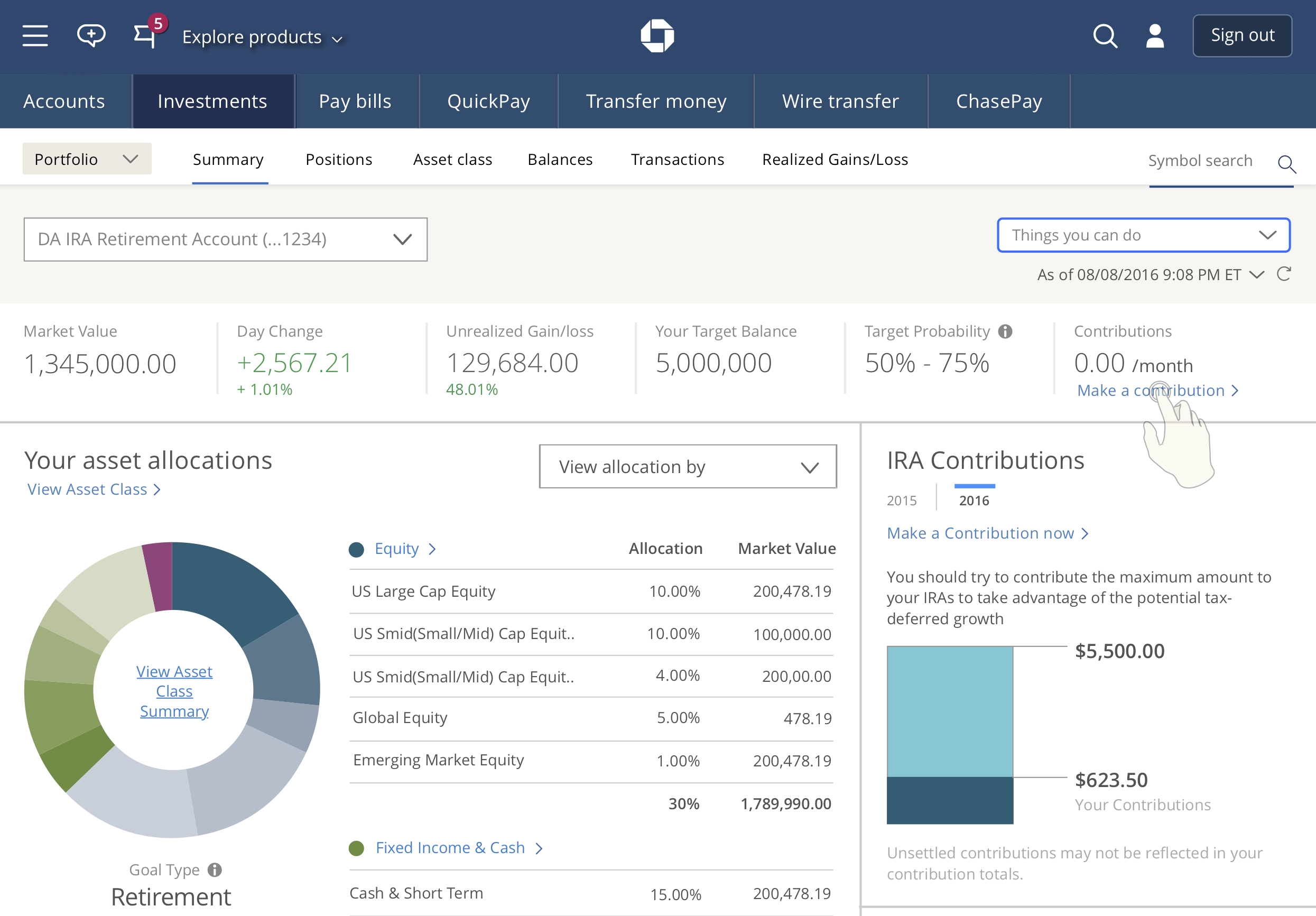
The Investment Summary dashboard is an extremely significant page for clients. They need to see all their information and numbers in a snapshot view before diving deeper into their accounts. A compelling visual journey takes this page a step further, with clearly defined entry points and specific tasks.
Partners
Investment Summary product owner
Researcher
Designer
BSA + scrum team
Legal
Approach & results
Research determined our information hierarchy.
I worked closely with the product owner to ensure accuracy for all microcopy (especially labels and links).
The experience is clear and direct: there’s no ambiguity when the investor clicks “View Positions,” “Fixed Income & Cash,” or “View U.S. Overview.”
More data visualization to break up text and numbers. The dashboard shows as much as possible through colorful charts and graphs while being fully ADA compliant.
Additional collaboration with designers on the visuals, such as the color palette and image placement.
content design
-
Webex’s Content Design team
introducing Webex’s voice and tone
updating Webex’s voice and tone
Momentum Design System
creating a content design system
implementing a content-ready checklist for designers
Write Like Webex
supporting and rolling out Webex’s gen AI writing tool
ux writing
-
Control Hub
⭐ revamping and restructuring organization settings
⭐ creating a Getting Started guide
⭐ crafting a gamified security coach
Partner Hub
⭐ revamping and restructuring organization settings
⭐ creating a Getting Started guide
⭐ crafting a gamified security coach
Contact Center for admins
⭐ revamping and restructuring organization settings
⭐ creating a Getting Started guide
⭐ crafting a gamified security coach
Cisco Unified Identity
⭐ revamping and restructuring organization settings
⭐ creating a Getting Started guide
⭐ crafting a gamified security coach
-
conversational
design
-
Cisco AI Assistant for Control Hub
⭐ crafting AI Assistant messages for our admin audience
-
Chase Digital Assistant
content strategy
-
Digital Wealth Management
⭐ improving visual data for landing pages
⭐ optimizing double entry points for the most direct user journey
-
Digital Wealth Management
⭐ improving visual data for landing pages
⭐ optimizing double entry points for the most direct user journey
product copywriting
-
Chase Bank: Inclusive Design Guild
⭐ Anti-racism open letter (October 2020)
Potli
⭐ Potli's Guide to Your Star Sauce (January 25, 2022)
NYC Democratic Socialists of America
⭐ The NYC Thorn, No. 43: Council Speaker Candidates Court Joe Crowley’s Support (December 11, 2017)
Pandia Health
⭐ Graham-Cassidy Repeal: We’ve Dodged Another Bullet. For Now. (September 26, 2017)
-
Blackprints
⭐ Blackprints kickstarter + blog updates (April 2013)
Halo Belt
⭐ HALO Belt 2.0 kickstarter campaign + blog updates (February 2014)
⭐ HALO Mini kickstarter campaign + blog updates (May 2013)
⭐ HALO Zero Bag kickstarter + blog updates (January 2013)
⭐ HALO Belt kickstarter campaign + blog updates (June 2012)